Youtube Redesign 2012 - More focused on subscriptions
I don’t know how many of you got the new design of Youtube. But I have been getting a new homepage on Youtube on and off for about a month and now it seems to be stable. Sometimes it was only available on Chrome, but now I have tested in both Firefox and Chrome. Now it looks so much better. Youtube is making use of most of the unused space, better font, more visible links and features, easily accessible analytics and video manager and most importantly more focus on subscriptions.
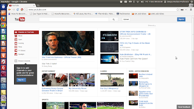
Now the recommended videos is called What to watch, which I think is easy to understand even for a toddler. On the homepage you get popular videos and categories like Popular on Youtube, Music, Sport, Gaming, Films, TV Shows and Spot Light. From the order of the categories, it looks like Google is trying to prioritize Music than others. The Spot Light category shows you popular videos in your country.
The hidden menu on top, which opens up on clicking your name and the Google+ button is also tweaked a little. Space utilisation is better although there is a little unused space. All in all Google is trying to propagate its new simple minimalistic design language across Youtube. This time you won’t need any time at all to get adjusted to the new design, like the previous redesign.
Checkout the screen shots, if you haven’t already got the new design.
New Youtube Homepage #
 Now with more videos and easily accessible links on the left hand side.
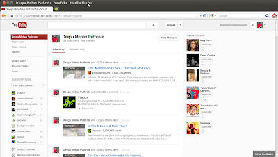
Redesigned Hompage after signing in #
 Here we get the recommended videos and social updates. And again all other options are easily accessible at the left hand side menu. We also have popular channels and recommended channels on the right hand side.
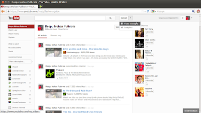
Analytics and video manager #
This is handy for a Youtuber. Both Youtube analytics and video manager can be now reached with just one click.
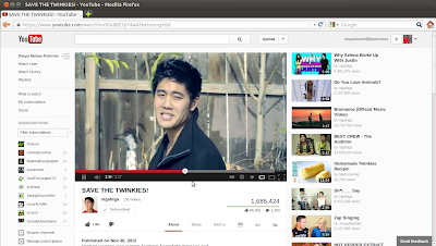
Redesigned video screen #
Have a look at the new like button and meta informations. The comment section seems to be now more focused on the comment text rather than on likes.
Overall I would give a 8/10 to the new Youtube design.

